Goal
- To redesign the layout of the Cluster Explorer to improve the overall user experience
Problems
- The current design is difficult to understand.
- The current design is also not very scalable, because the base layout is “circular” and if the nodes have a larger number of pods, it will appear “too dense”.
- The segregation of the pods with “critical” (and “warning”) issues are not very clear.
User Persona
- DevOps/Support Engineers.
- Software Engineers
User Research
- 1:1 contextual interviews conducted with 12 users
- Surveys were sent to 24 users
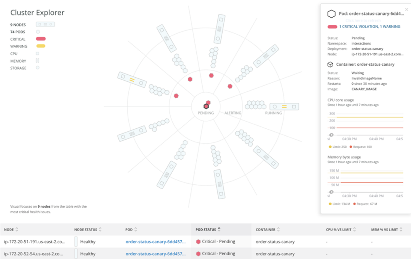
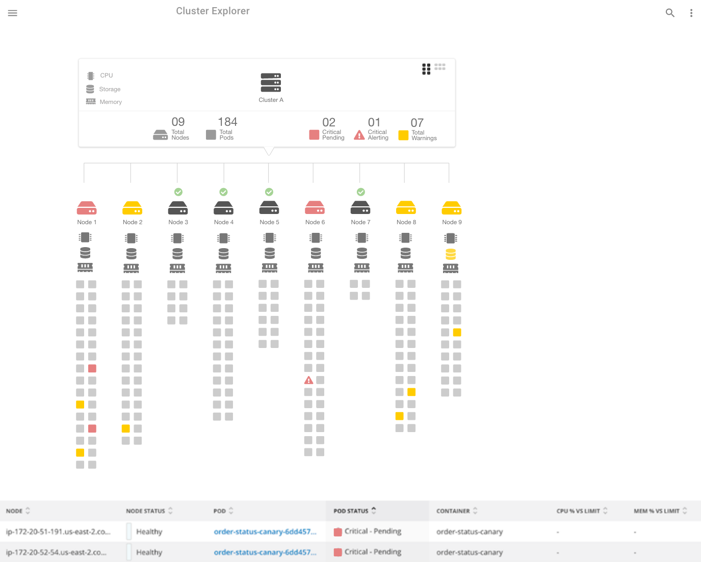
Design Overview
- The proposed design has a “linear” layout.
- This design is also scalable. Depending on the number of pods in each node, the pods can be arranged in 2 or more columns for a node.
- The design is also easier to understand.
Assumptions
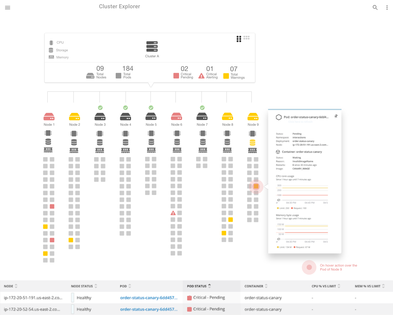
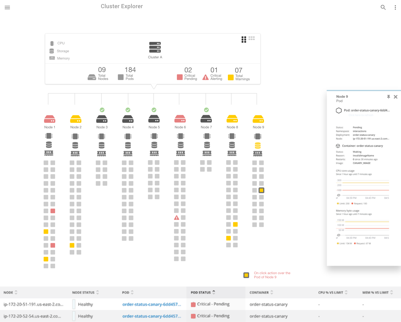
- All the pods in each node are “clickable”.
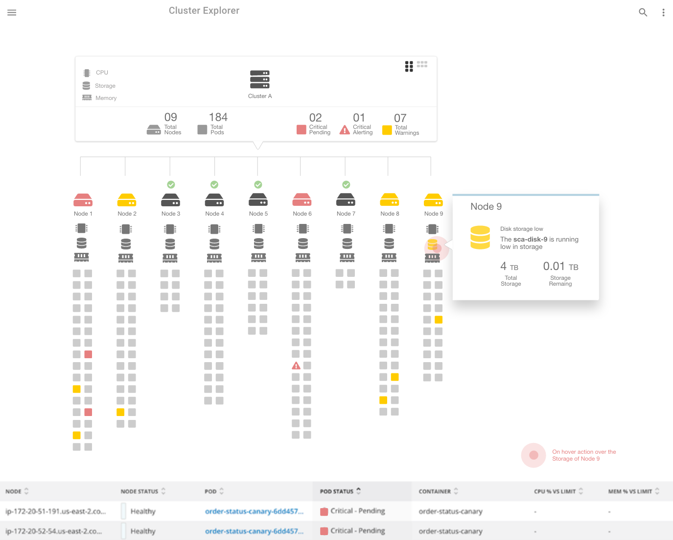
- All the node peripheral components (i.e. memory, CPU, and storage) are “clickable”.
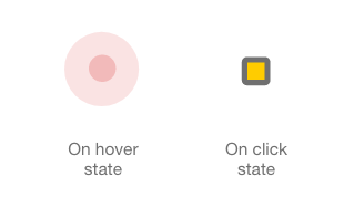
- Users can “hover” over the pods.
- Users can “hover” over the node peripherals.
- Hovering over a pod or the node peripheral will show a tooltip with supplemental information about the component.
- Clicking the pod or a node peripheral will open up a sidebar modal to the right with detailed information of the selected component.
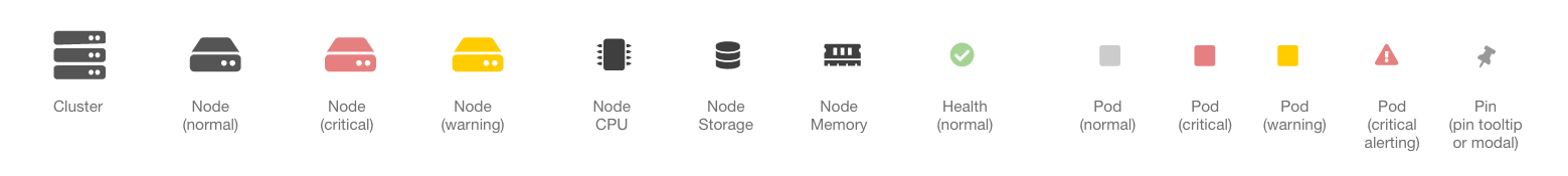
- The nodes with no issues (or healthy) are indicated by a green checkmark.
- The nodes with red or orange have at least 1 or more critical issues or warnings respectively.
- The summary card of the cluster shows the stats regarding the total number of nodes, number of pods, total critical pending, total critical alerts, and warnings.
- The pin icon on the tooltip indicates that the modal can be “pinned” to the page and will not disappear on “blur” action.
- The UX design mock-ups are not interactive. The interaction states have been indicated on each page.
Prototypes & Mockups
Icons
Interaction States
Designs