Product: Liveweave.com
Understand
Goal
Build an easy to use online coding tool to learn, practice, share and test HTML, CSS, and JavaScript code. This tool is similar to Google Docs editor, but instead with a focus on coding/programming.
Audience/Target users:
- School Teachers
- Students (School and University)
- Web design and development professionals
Problems
- Most web apps require “login” to even try to write a code
- A complicated sign-up/registration/validation process may be required
- To test HTML, CSS and JavaScript code locally, you have to click “refresh” in the browser every time
- Will have to email the HTML, CSS or JavaScript code in order to download and continue to use it later
- To share the test code with peers, the only way to do it is to “check-in” the test code or email it, which is very cumbersome. It is also not a secure way.
- While there may be some online coding tools to write and test HTML, CSS, and JavaScript code, most don’t “feel” like a proper IDE (Integrated Development Environment) as they don’t have common features like “code-hinting”, etc.
- The only way to test “responsive” design in a local environment is to use the built-in browser features like “Developer Tools” which is quite “intimidating” for beginners.
- Users would like to have the choice to keep their work either private or public.
- A collaboration feature is almost non-existent in similar freemium online coding tools, where the teachers can share/help students with their work, in real-time. This feature is also not possible while teaching coding in local computer/systems.
- Users have to switch between the HTML, CSS, and JavaScript files every time, instead of able to see all 3 codes at the same time.
Design/Process Strategy
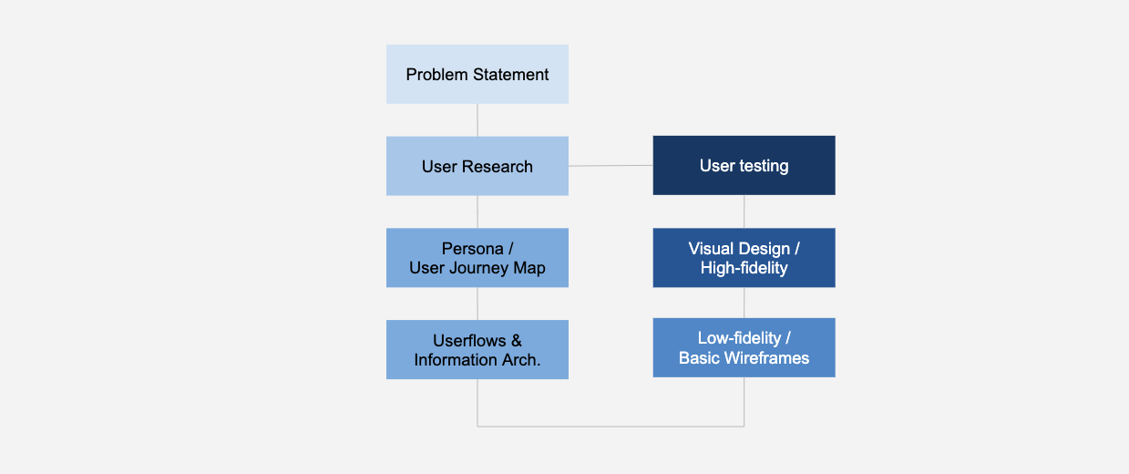
Research
1:1 Interviews directly with users:
- I interviewed several teachers, and a few students and web designers to understand what are their goals over a period of 4-5 weeks.
- The interview duration ranged from 30 mins to 45 mins.
Focus groups:
- I conducted focus groups with teachers and a few students to understand their “feelings” and “expectations” for building an online coding tool.
- These sessions typically were 1.5 to 2 hours long.
- Audience size for a session: 4 to 6 users (from the same school district/college)
Surveys:
- I sent out a few surveys to several web designers from different online communities (Linkedin, Github, StackOverflow, Behance, University professors).
- Quite a few users responded back. Google Forms were used for these surveys.
Analyze
Research Analysis
- Users want a “no-login” coding tool where they can practice learning HTML, CSS, and JavaScript.
- Users can save their code/work in the cloud so that they can access it later from home or school/office.
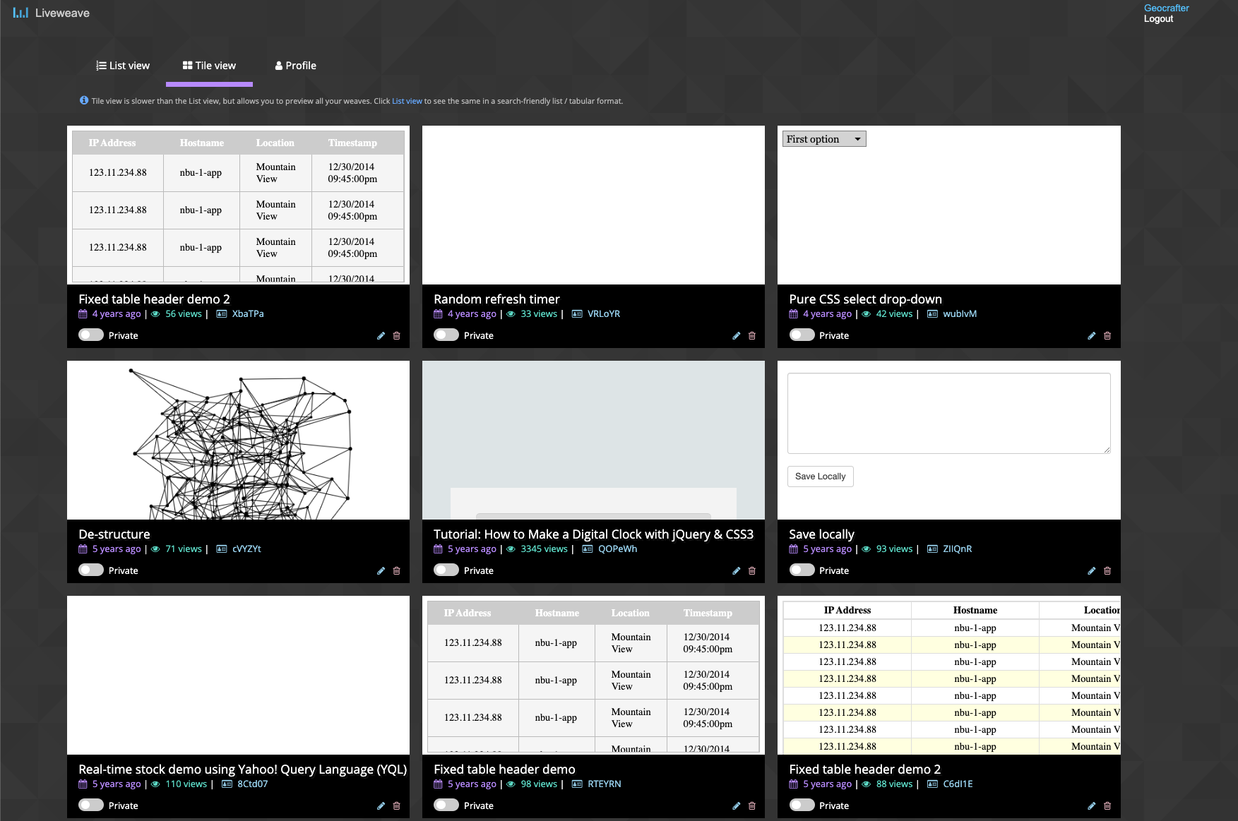
- Users can view their saved work in both a “tile” and “list” layout. “List” is easier to search while “Tile” is easier to get a preview of the work.
- Users would like to have an auto-complete/code-hinting feature to learn about various attribute/command options in HTML, CSS and JavaScript.
- Users would like to “clean” and “auto-format” their code for easier maintenance.
- Users would like to “share” their work with their peers, and social platforms.
- Users would like to “download” their work and send it via email.
- Users would like to add CSS and JavaScript libraries to leverage various design and interaction features.
- Users would like to have a “collaboration” feature where the teacher can share/demo work with students in real-time.
User Persona
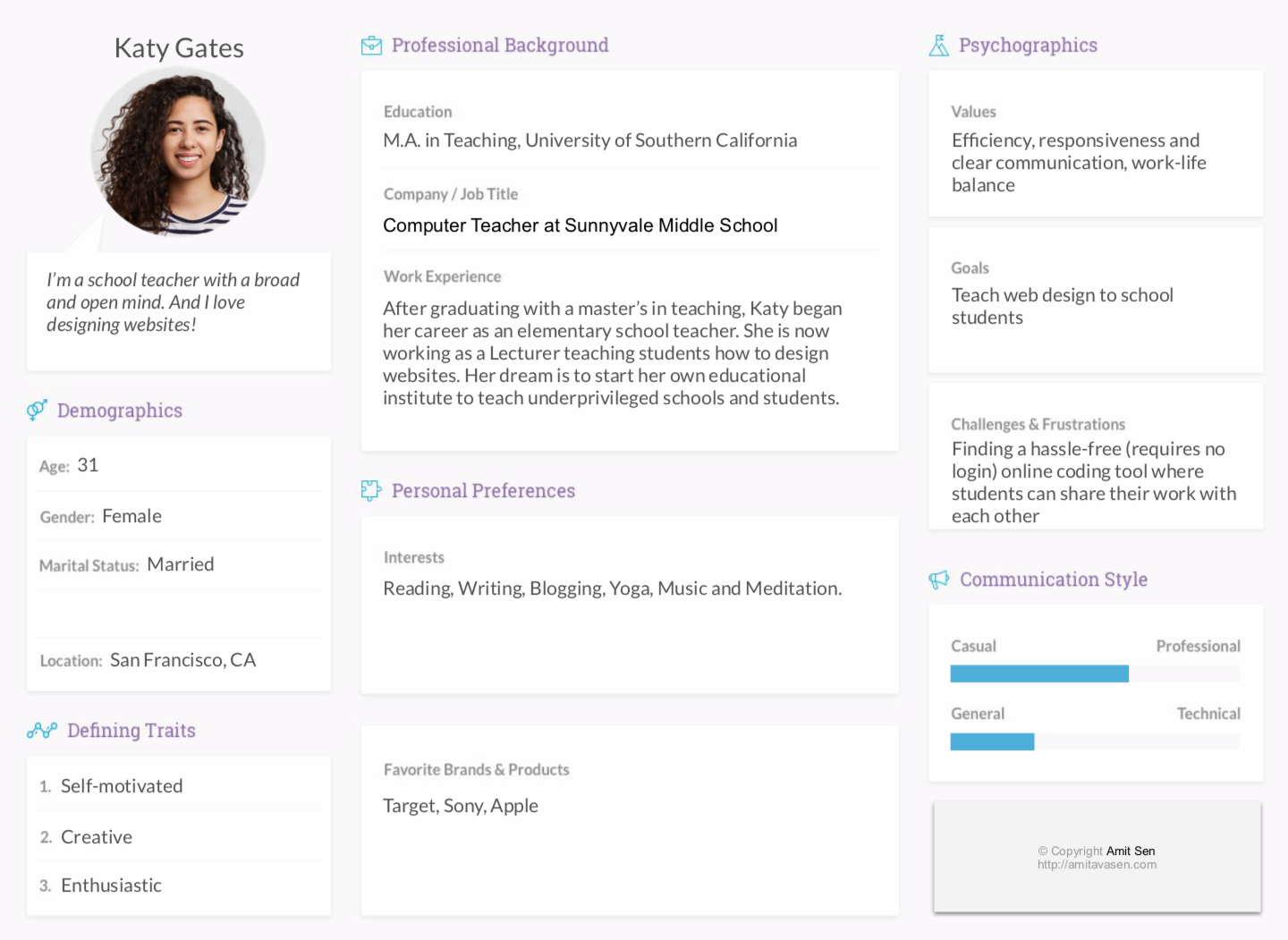
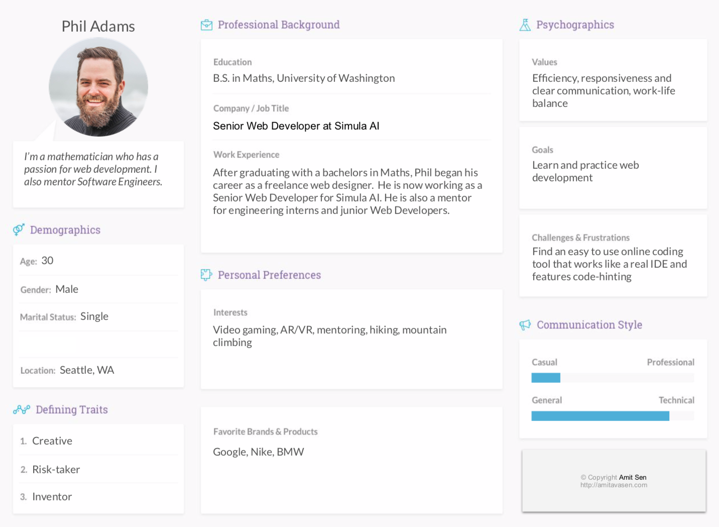
Based on the background of the users I came across the following two Personas.
1. Katy Gates, a school teacher who also has an interest in designing websites
2. Phil Adams, a mathematician who also loves teaching web development and programming
Design & Prototype
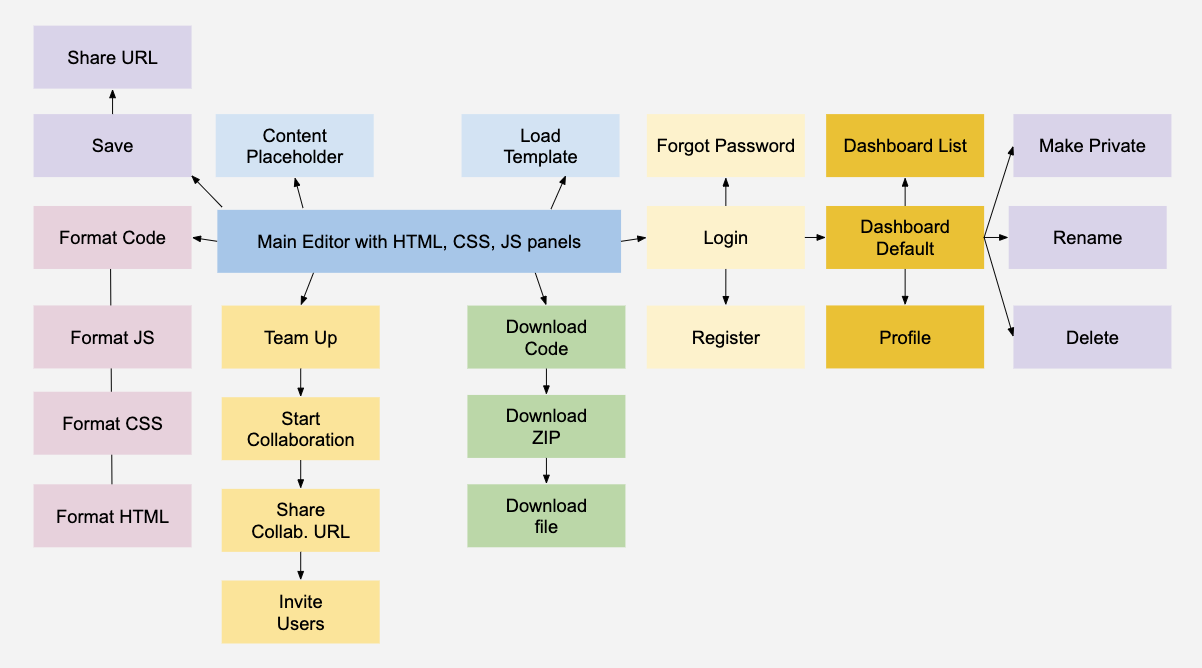
User Flow
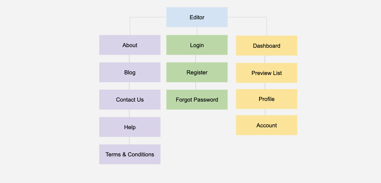
Site Map
Wireframe
Editor page – Basic Concept and First pencil sketch
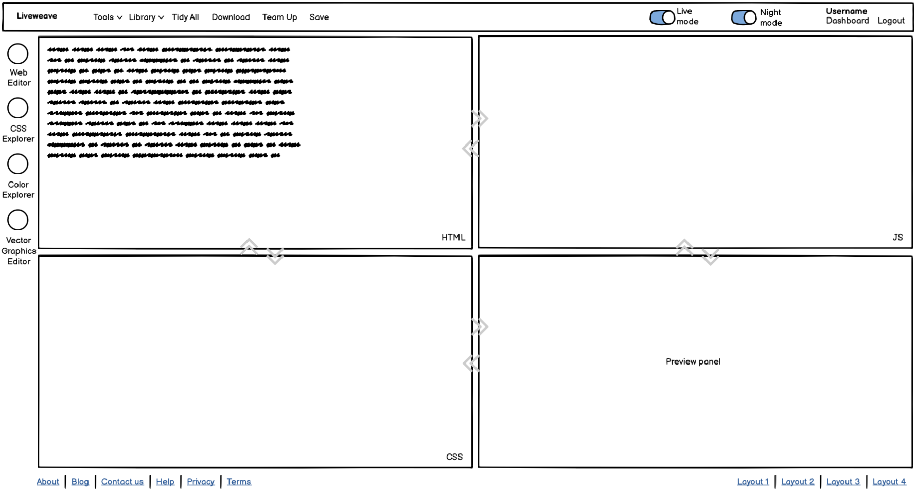
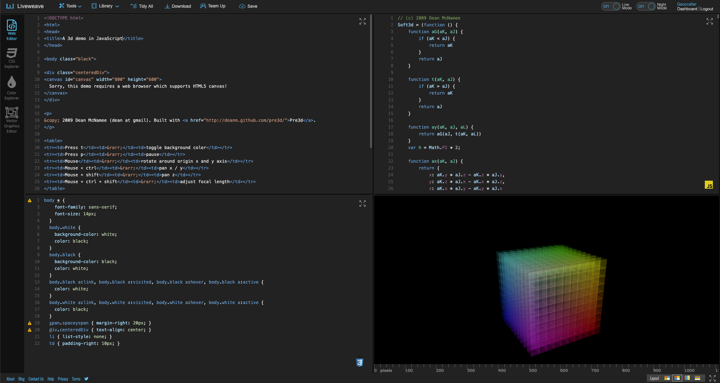
Editor page – Final
Dashboard page – First Sketch / Wireframe
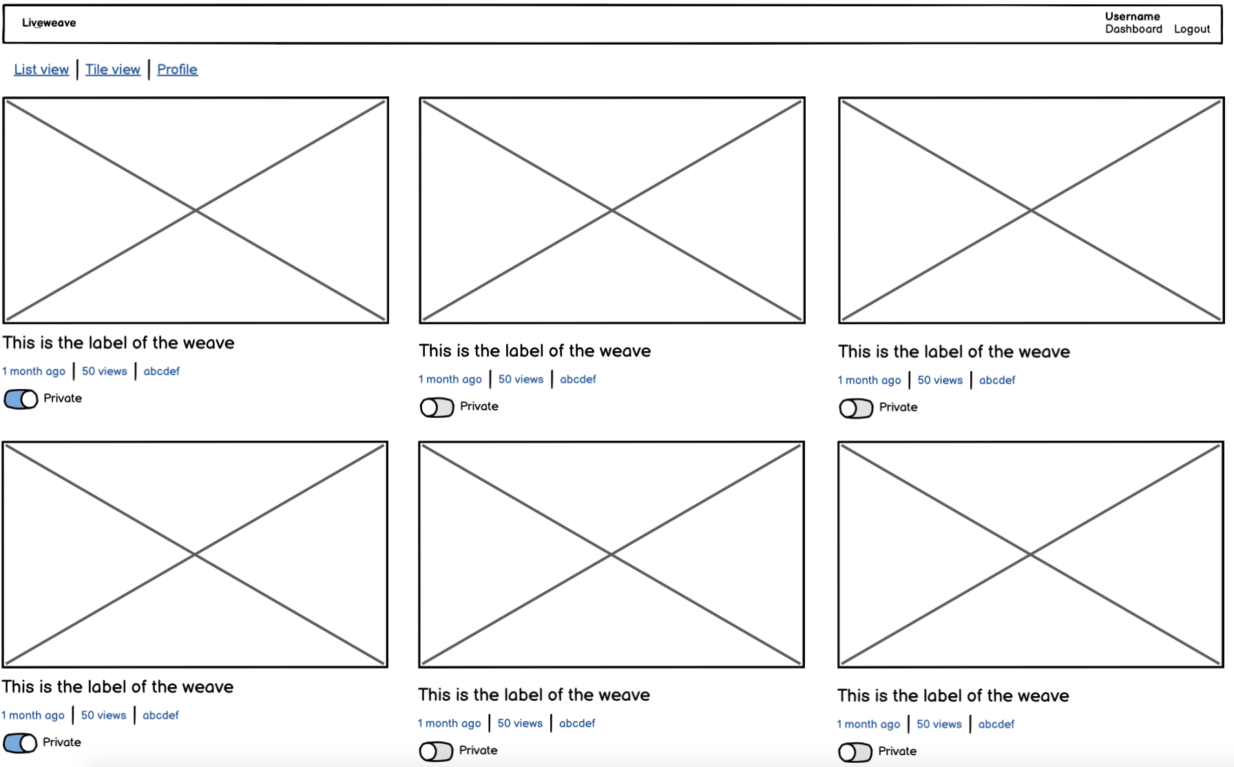
Dashboard page – Final
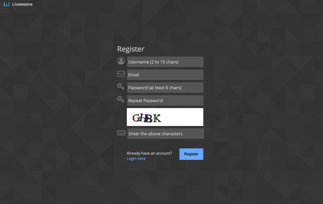
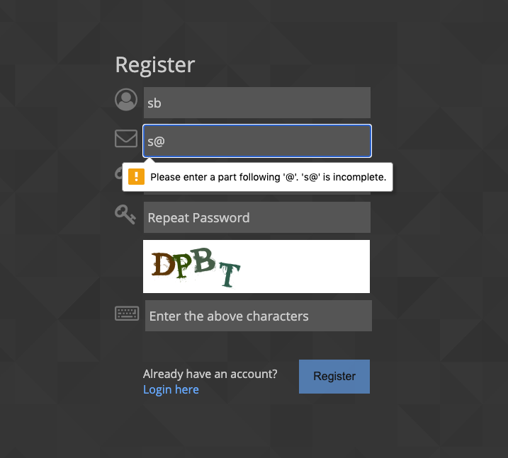
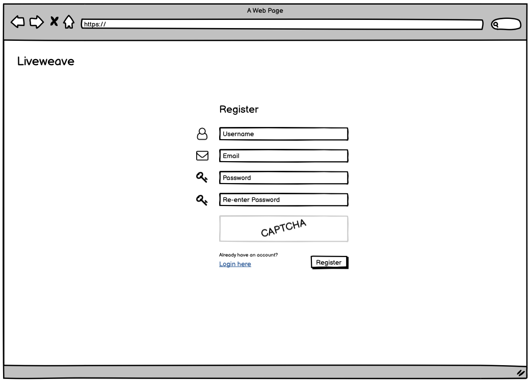
User Registration Page
Login Page
Error handling for form elements
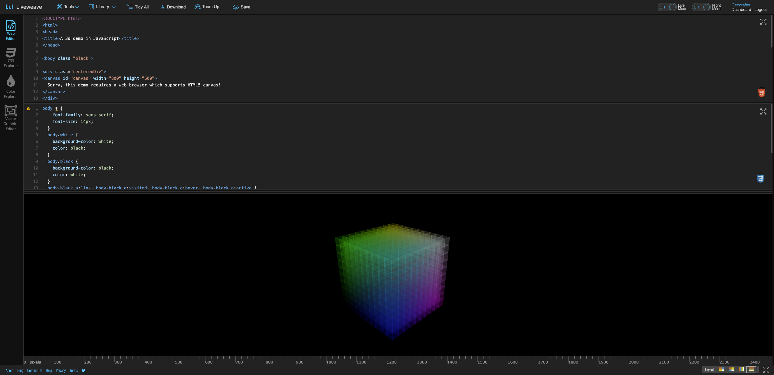
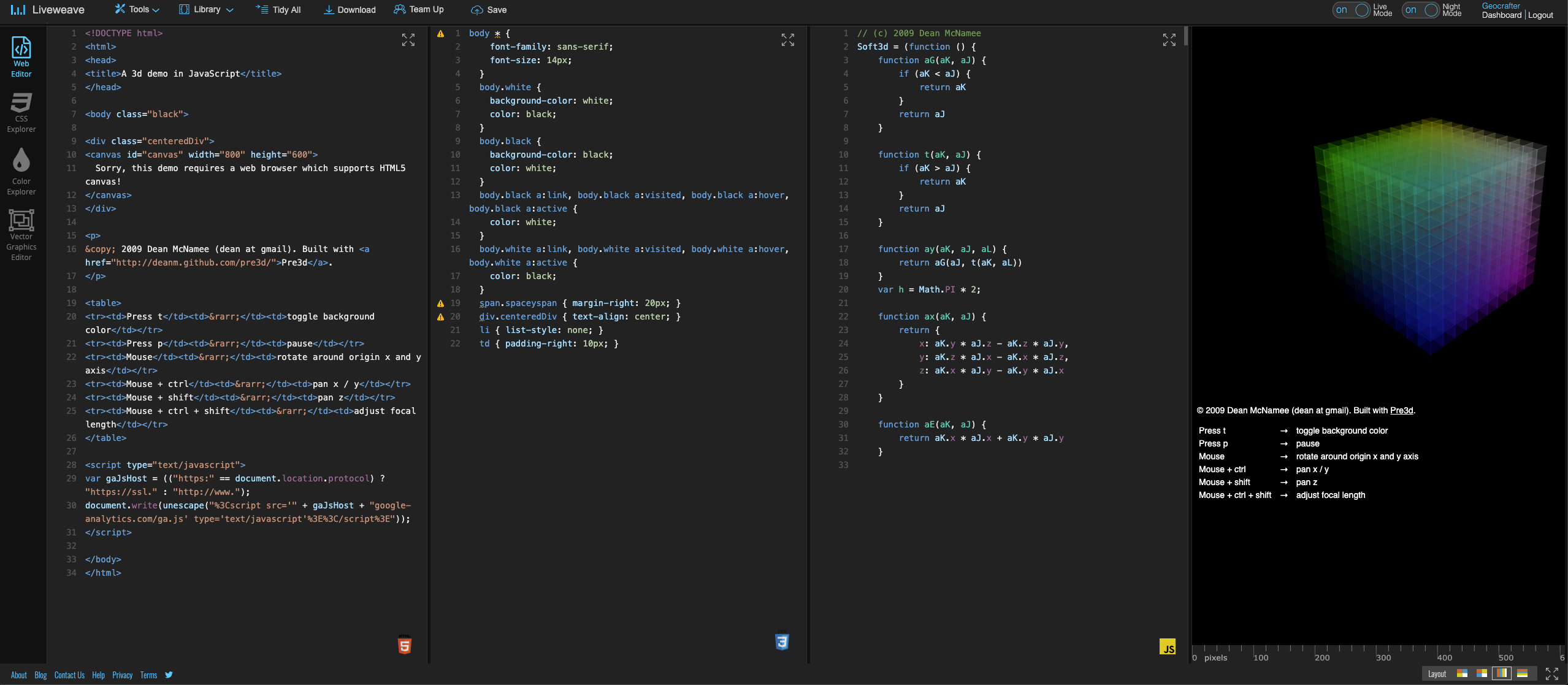
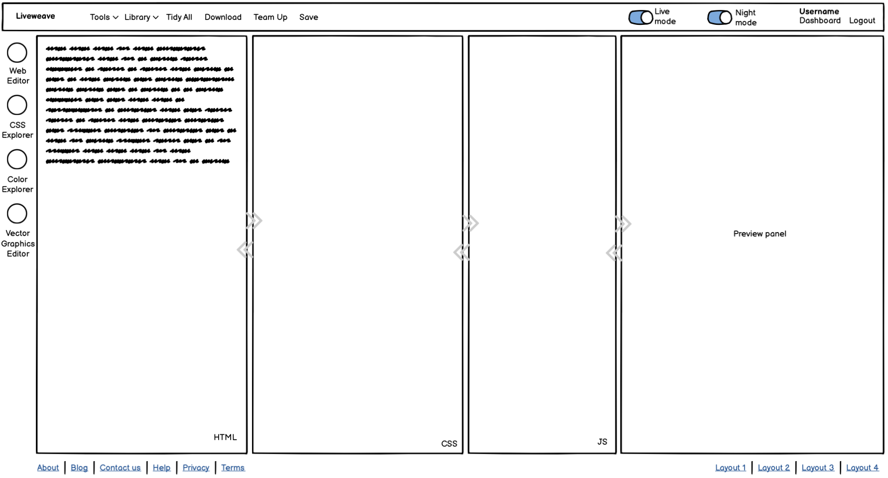
Multiple Layouts
- Users wanted multiple types of layouts
- Some layouts focus more on designers (HTML, CSS, and Preview panels), while others focus more on engineers (JavaScript, and Preview panels)
- The layouts can be changed by the users in real-time (dynamically)
The following layout is easier when users are testing the “responsive” design (especially in landscape mode) of the page/code.
The following layout is easier when users are testing the “responsive” design (especially in portrait mode) of the page/code. It is also a preferred layout for a multi-monitor setup.
Top bar (Primary navigation)
Based on the User Research data and analysis, the top-bar has the “most important” and “most popular” navigation elements
- Tools menu – Users can select options
- Library menu – Users can select an external CSS or JavaScript library
- Tidy All – Users can auto-format code (HTML, CSS and JavaScript)
- Download – Users can download code in .ZIP format
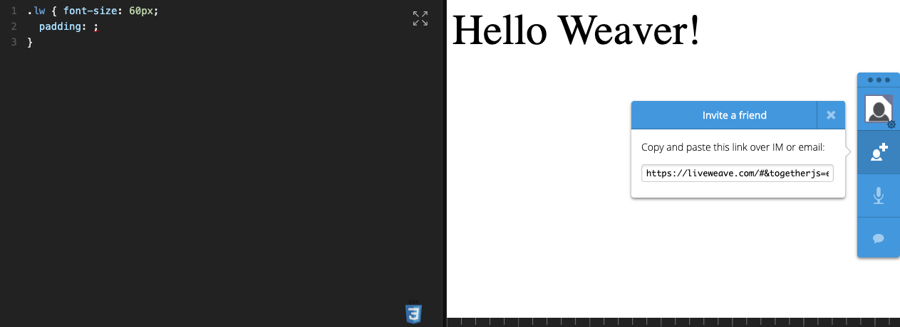
- Team Up – Users can collaborate (and perform code pairing) with other users in real-time
- Save – Users can save the code in the cloud
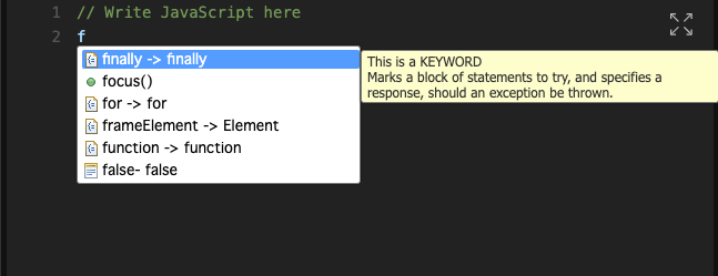
Code-hinting
- HTML – Users can select various attributes
- CSS- Users can choose from properties and values. Based on the user’s “usage”, some properties may also provide examples for some values
- JavaScript – Users can choose from several JavaScript keywords and preset/built-in functions. It is also context-sensitive and the context menu changes content based on user’s JavaScript code

Team- Up
This is a collaboration feature where users can perform “code pairing” and modify/edit code remotely.
- Multiple users can connect to the same session
- There will be a single/same URL for the same session. Any user can join the session from the same URL
- Users can see each other cursor movement
- Users are given a default name by default, which they can change later
Test & Re-analyze
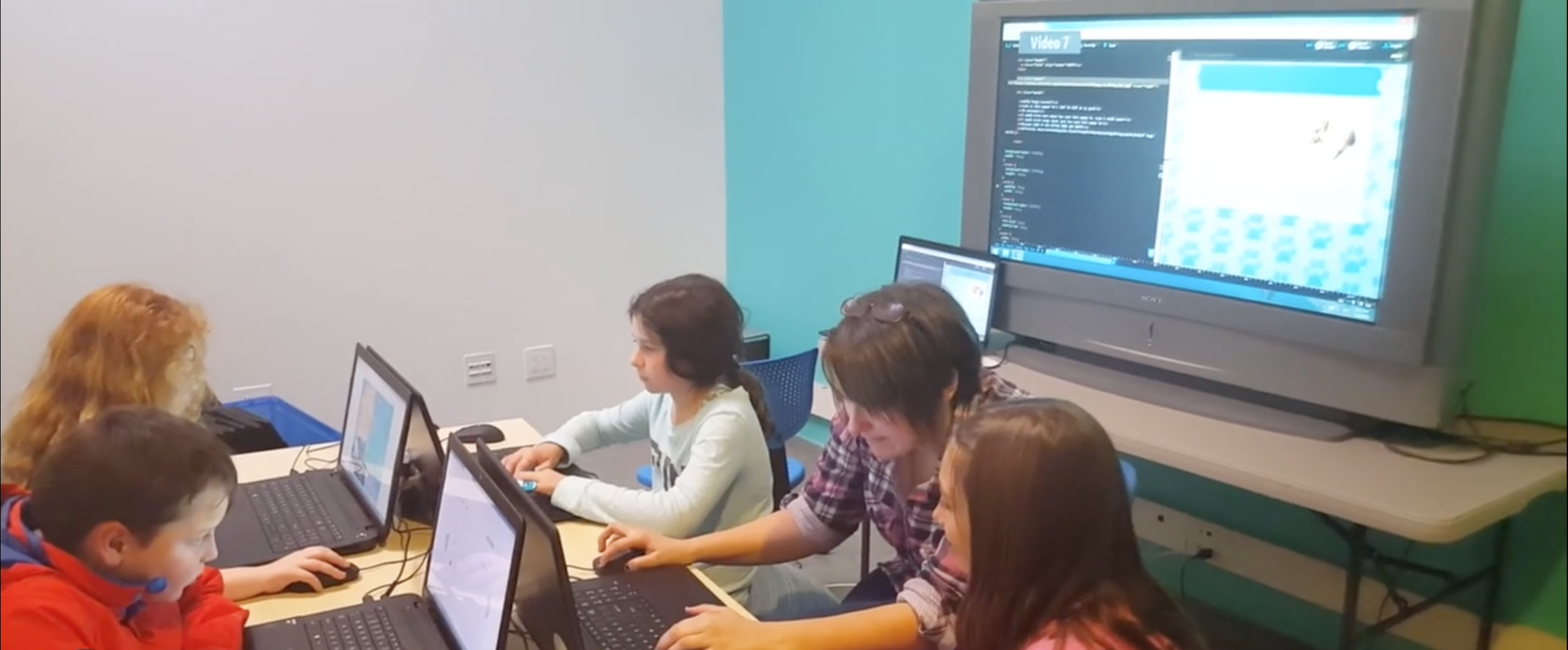
After the web app was launched, I conducted User Research directly with teachers at various educational institutes.
- Surveys – Several surveys were sent to users through Linkedin, StackOverflow, and other social platforms.
- Usability Testing was conducted remotely at several educational institutes.
Usability Testing
- Some of the sessions were moderated.
- Users (some students and some teachers) were given a set of tasks to be completed.
- The whole session was being streamed live and recorded.
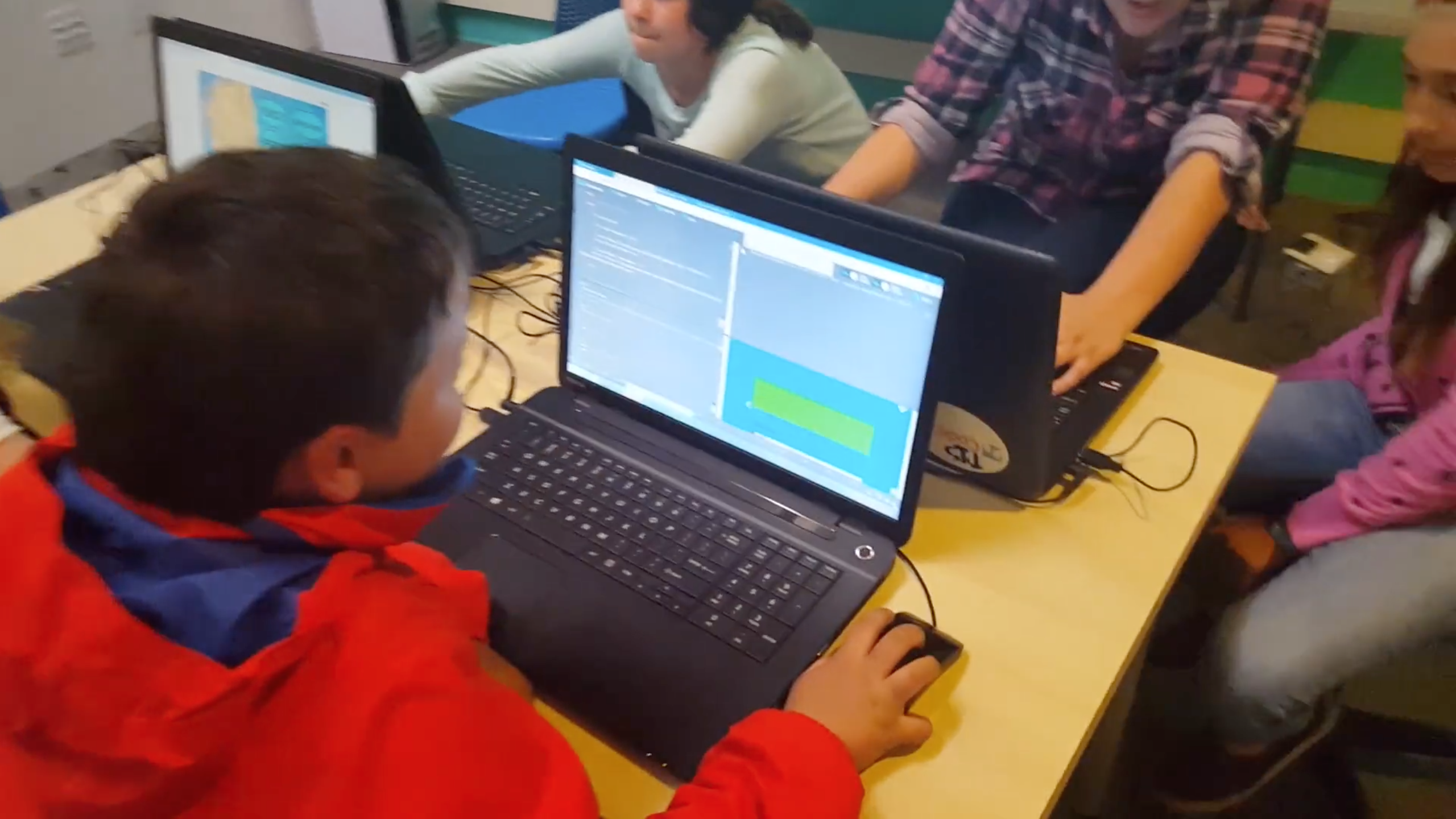
Some photos of students/teachers using Liveweave.com
Measure / Re-analyze / Research Analytics
Final Product URL: Liveweave.com
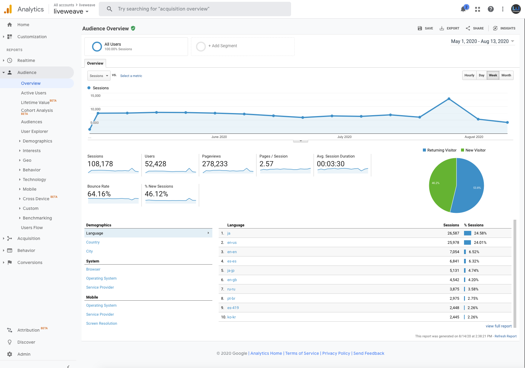
- Google Analytics data was reviewed over a period of 90 days
- User behavior was studied (some examples below):
- Active users
- Lifetime value
- Cohort analysis / retention value
- Platform
- Technology
- User flows
- Demographics
Product Reviews
Liveweave has been mentioned on various websites and top online web design magazines. Here are some of the links:

