I was part of an internal team working on building a Design System at Veritas. The design was called Polaris and has the following components:
- Ready to use UX design components for Adobe XD and Sketch
- Patterns
- Accessibility
- App Layout
- Color palettes
- Internationalization
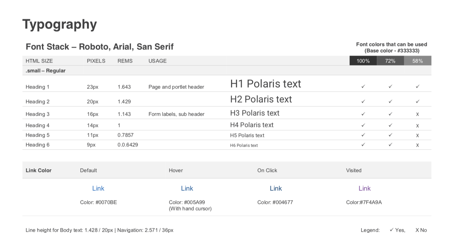
- Typography
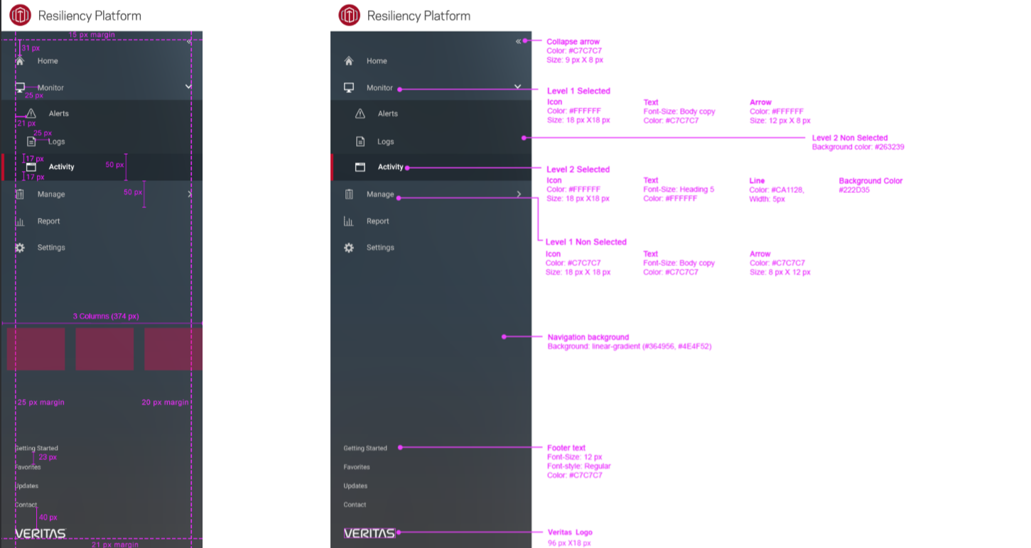
- Navigation
- Themes (in progress)
- UI Components
- Accordion
- Alerts
- Badges
- Buttons
- Cards
- Checkboxes
- Datalist
- Datatable
- Infinite scrolling
- Pagination
- With integrated search
- With integrated search + action buttons
- Date picker
- Dropdowns
- Forms
- Header (Topbar)
- Inputs
- List
- Label
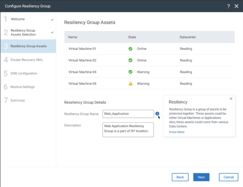
- Modal
- Modal with multiple actions
- Modal with info only
- Progress bar
- Radio buttons
- Select
- Sidebar
- Spinners
- Stepper
- Tables (a simpler version of Datatable)
- Tabs
- Textarea
- No format text
- With Rich text
- Toggle buttons
- Tooltip
- Tree view
- Wizard
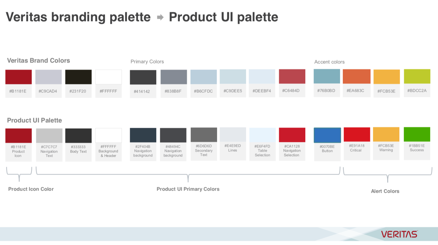
Color Palettes
- The color palette is based on Veritas marketing design guidelines
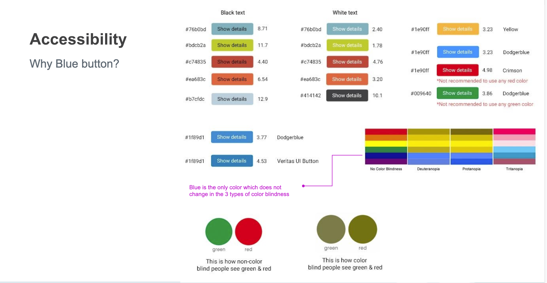
- Components colors are also based on accessibility ratio (and other related criteria)
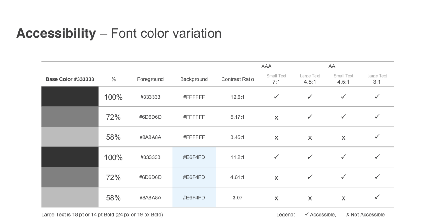
Accessibility
- Based on the Accessibility color contrast ratio
- Guidelines based on WCAG (Web Content Accessibility Guidelines)
Layout
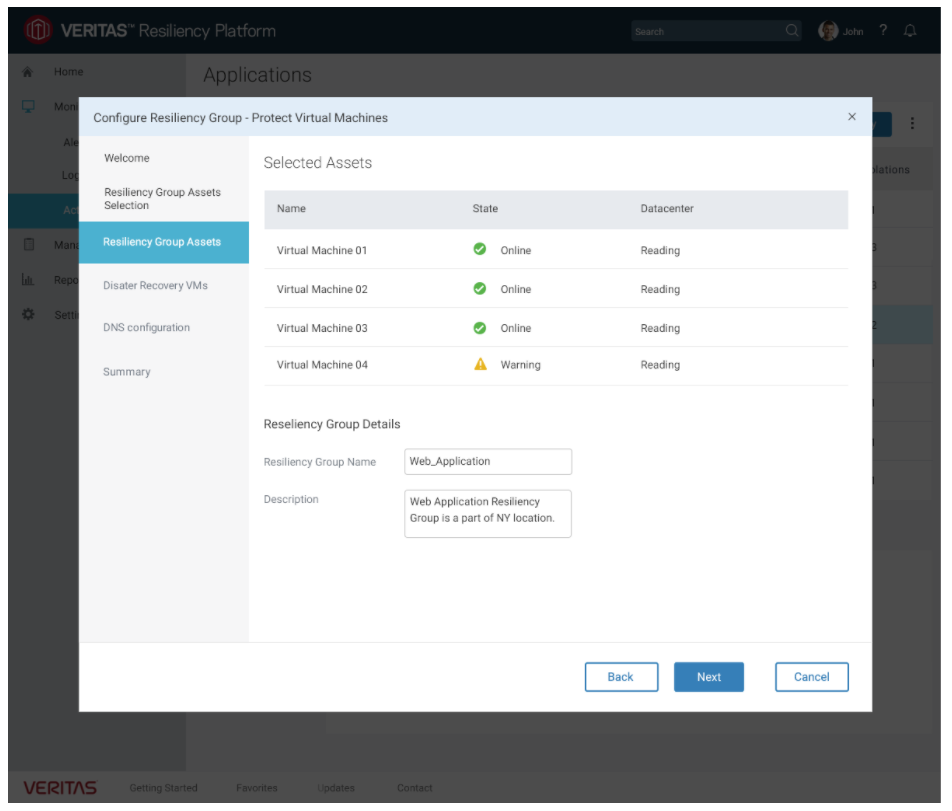
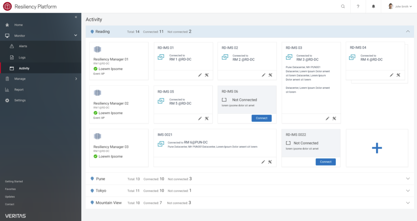
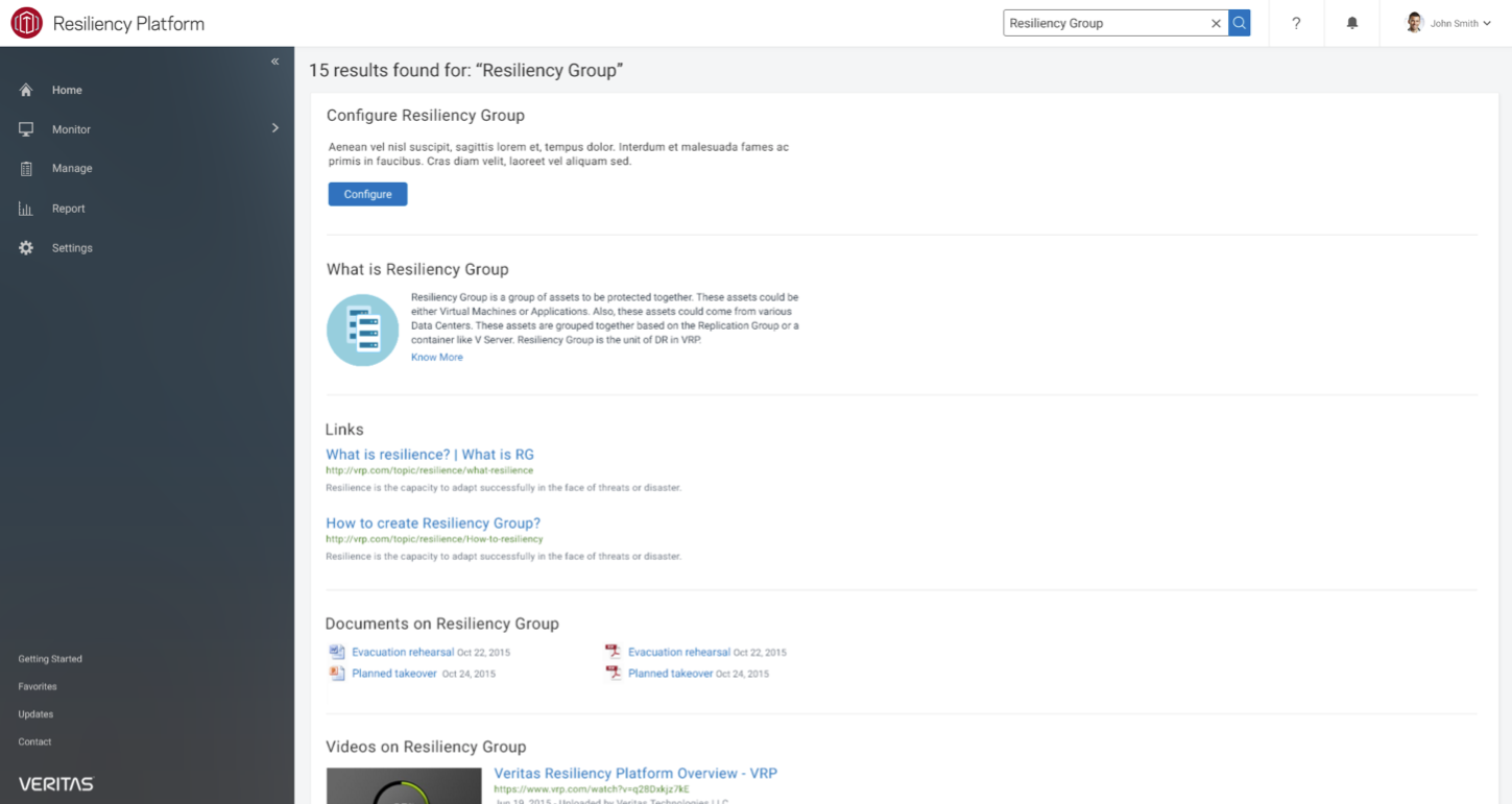
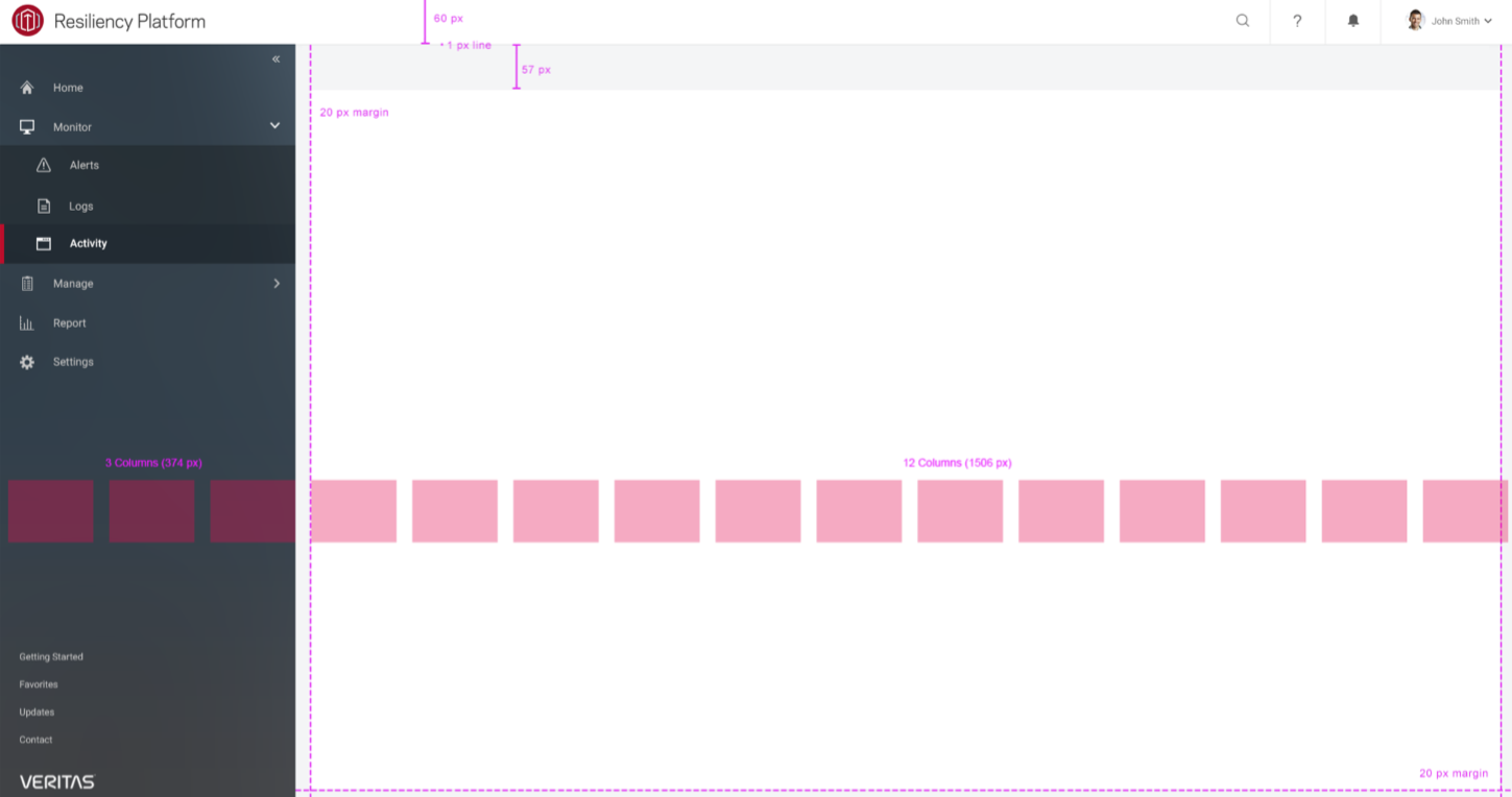
- The following shows examples of some of the layouts with standard “header”, “sidebar” and “panels”
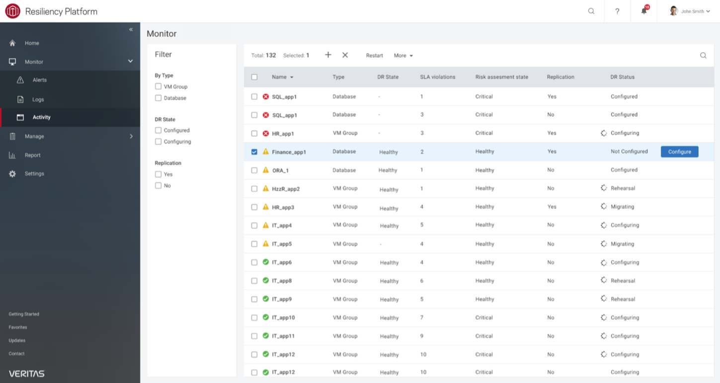
- Another example shows basic “datatable”
Style Guide
- Examples show the style guide for layout and the basic “grid” structure.
UI Components
- The list of UI components consist of 30+ different components to build a web app
- Each UI component typically consists of HTML, CSS (and SASS), and JavaScript
